Memo Published March 8, 2019 · 7 minute read
The Economies of the Blue Wall vs Those of the Blue Bubble
Ryan Zamarripa
In 2008, California, New York, and Massachusetts supported Barack Obama over John McCain by a combined total of nearly 5.5 million ballots, or 25 points. In the same year, Obama beat McCain in Michigan, Pennsylvania, and Wisconsin by more than 1.8 million votes, or roughly 14 points.1
In 2016, Hillary Clinton’s total margin over Donald Trump actually surpassed Obama’s in California, New York, and Massachusetts, by both its raw total of 6.9 million votes and its 29 percentage points. But Clinton lost Michigan, Wisconsin, and Pennsylvania by a combined total of just under 80,000 votes, or about one-half of a percentage point.2
From 1992 to 2012, these six states all supported the Democratic presidential nominee. That, of course, all came crashing down in the election of 2016 as Michigan, Pennsylvania, and Wisconsin voted for Donald Trump. This split was not only political; the economies of these three states were also diverging from those of California, Massachusetts, and New York between 2009 and 2016.
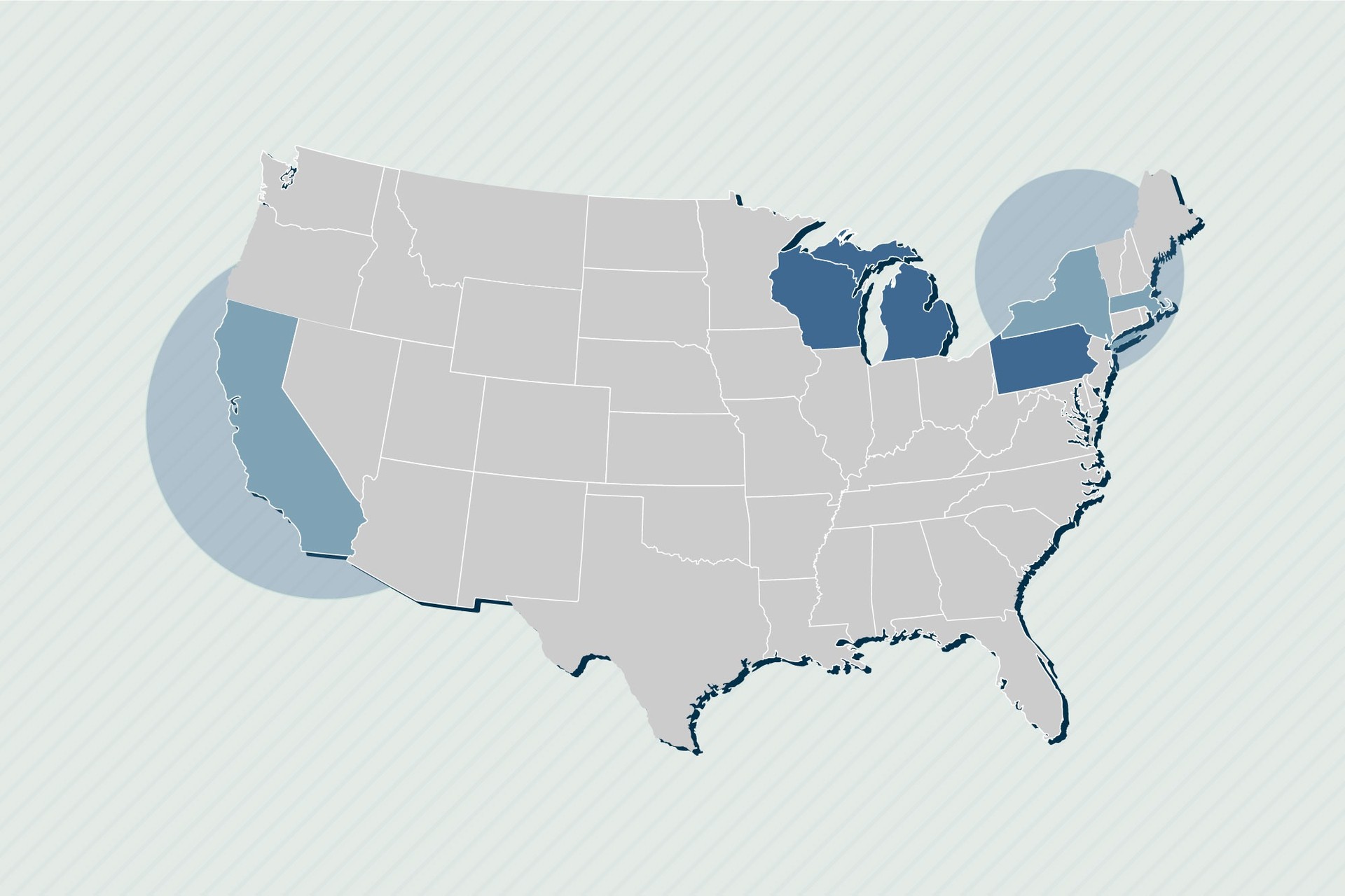
In this paper, we compare the economies of the Blue Wall (Michigan, Pennsylvania, and Wisconsin) to the economies of what we dub the Blue Bubble (California, Massachusetts, and New York) between 2009 and 2016. We find that the Blue Bubble was motoring ahead with robust business growth, job growth, wage growth, population growth, and higher employment to population ratios. The Blue Wall experienced stagnant business formation, anemic job and wage growth, meager population growth, and lower employment to population ratios. This electoral bifurcation coincided with the bifurcation of opportunity in the U.S. economy.
|
Blue Bubble |
Blue Wall |
|
|
Real Average Annual Pay, 2009 to 20163 |
+9.0% |
+6.2% |
|
Net Business Growth, 2009 to 2016 |
+6.5% |
+0.3% |
|
Net Private Sector Job Growth, 2009 to 2016 |
+12.5% |
+8.4% |
|
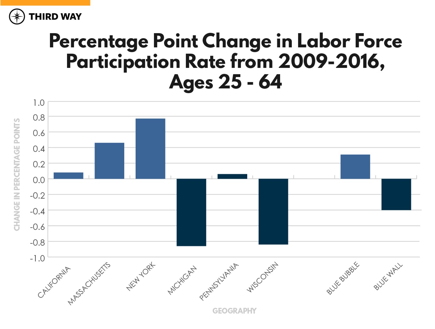
Change in Labor Force Participation Rate, 2009 to 2016 |
+0.3 p.p. |
-0.4 p.p. |
|
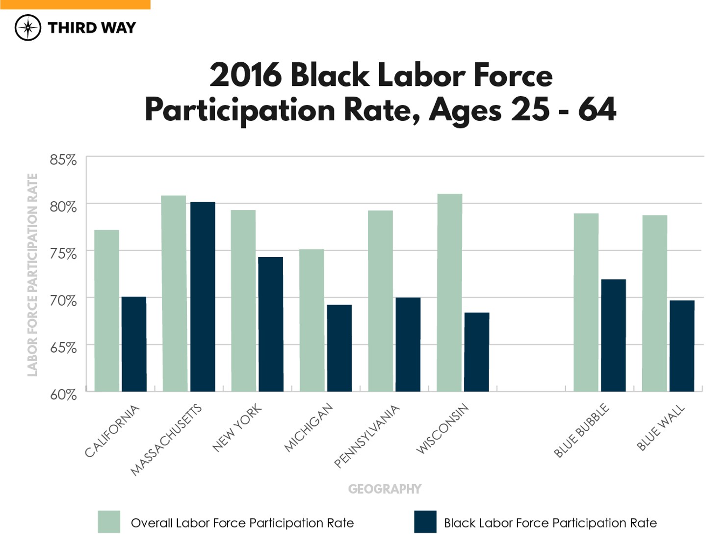
Black Labor Force Participation Rate, 2016 |
72.9% |
69.2% |
|
Latino Labor Force Participation Rate, 2016 |
76.7% |
73.4% |
|
Percent of Population 25+ with a Bachelor’s Degree or Higher, 2016 |
33.8% |
28.5% |
|
Change in Bachelor’s Degree Holders Aged 25+, 2009 to 2016 |
+2.5 p.p. |
+3.1 p.p. |
1. Business growth is much stronger in the Blue Bubble than it is in the Blue Wall.
From 2009 to 2016, the number of private sector businesses in the Blue Wall increased from about 661,000 to 663,000, a net gain of just 0.3%. Michigan and Wisconsin actually experienced a net decline in businesses, while Pennsylvania saw growth of just 1.0%. It was a different story in the Blue Bubble; together, California, Massachusetts, and New York saw the number of private sector businesses increase from roughly 1,540,000 to 1,644,000, for total growth of 6.5%.4
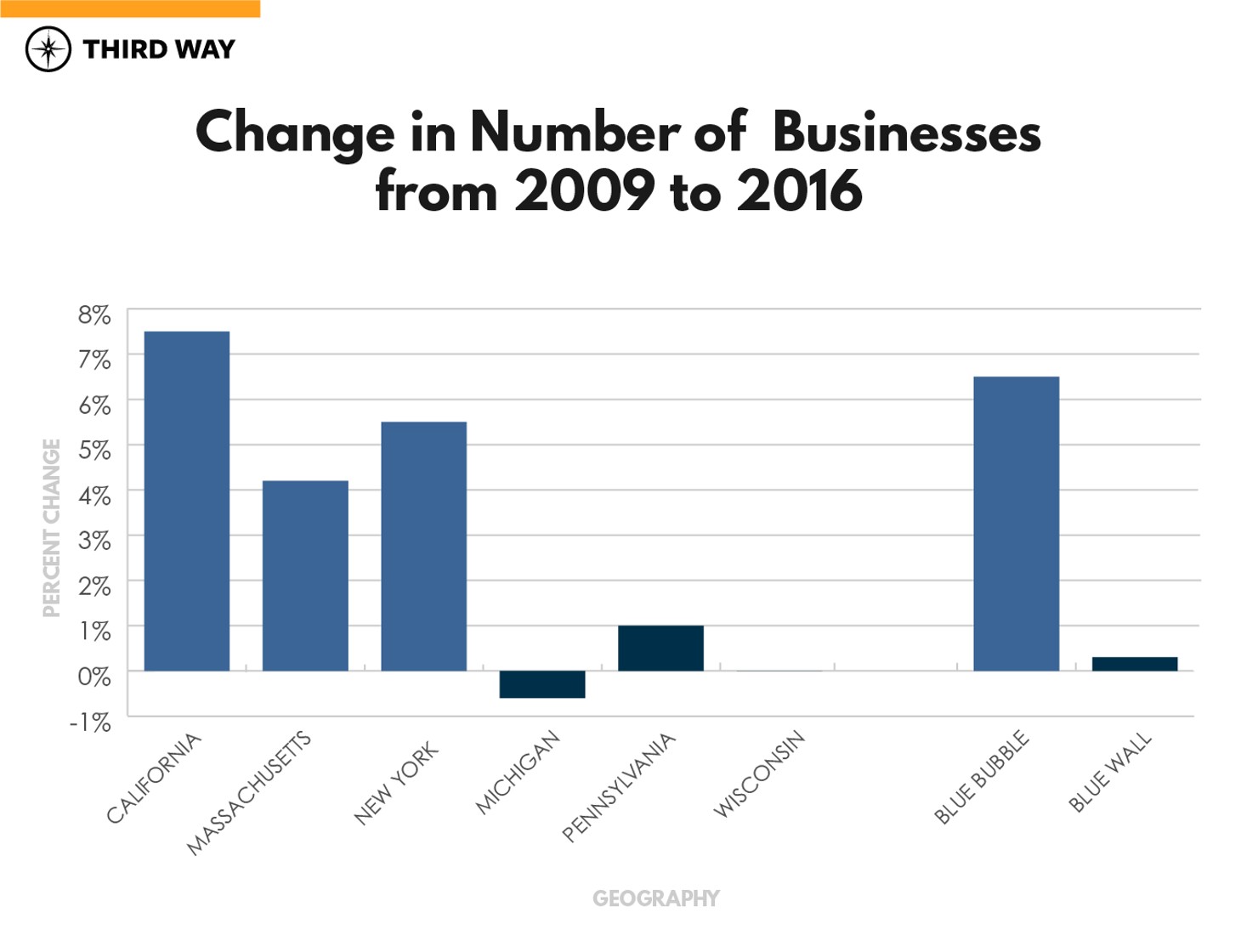
This largely flat growth of businesses was not evenly distributed among all counties in the Blue Wall. Urban counties saw their number of businesses grow by 0.5%, while non-urban counties saw a decrease of 2.8%. For the 28 completely rural counties (out of the 222 Blue Wall counties), the number of businesses shrank by 3.9%.5 In the Blue Bubble states, urban counties experienced net business growth of 6.7%—far higher than non-urban counties, which experienced a net business contraction of 3.4%.6
2. Private sector job growth is significantly stronger in the Blue Bubble than in the Blue Wall.
From 2009 to 2016, private businesses in the Blue Bubble added 2.9 million jobs, which corresponds to a 12.5% increase. Meanwhile, the Blue Wall added around 900,000 jobs—an 8.4% increase.7
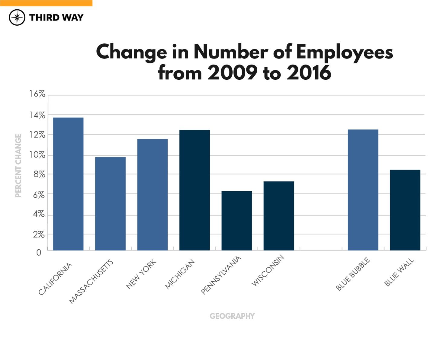
If the Blue Wall had experienced the same job growth as the Blue Bubble over this time period, there would have been over 450,000 more jobs in Michigan, Pennsylvania, and Wisconsin in 2016.
3. Incomes are higher and rising more quickly in the Blue Bubble than in the Blue Wall.
In the post-Recession period, average annual real income in the Blue Wall grew by 6.2%. In the Blue Bubble, incomes over this period rose by 9.0%—over two-and-a-half percentage points more.8
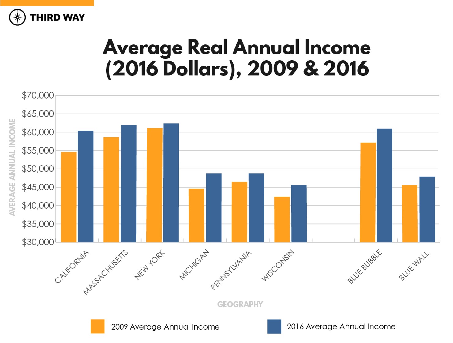
Incomes didn't just rise faster in the Blue Bubble; they were also higher to begin with. In 2016, the average income in the Blue Wall was about $48,000, while that in the Blue Bubble was around $62,000.
4. The Blue Wall is experiencing more people drop out of the workforce than the Blue Bubble.
A whopping 94.6% of counties in the Blue Wall had a lower labor force participation rate in 2016 than they did in 2009.9 For the Blue Bubble, the same figure was 78.4%. This means that after the Recession, workers across far more places in the Blue Wall were dropping out of the workforce than they were in the Blue Bubble. In short, far fewer places in the Blue Wall supported the same level of employment in 2016 than in the Blue Bubble.
Geography aside, the Blue Wall as a whole has become less economically dynamic than the Blue Bubble. In 2009, workers aged 25 to 64 participated in the labor force at a rate of 78.1% in the Blue Wall, compared to 77.6% in the Blue Bubble.10 In 2016, the rates were 77.7% and 77.9%, respectively.11 This means that the Blue Wall saw a drop of 0.4 percentage points in the labor force participation rate among this age group, while the Blue Bubble experienced a 0.3 percentage point gain.
5. Population is growing nearly three times faster in the Blue Bubble than in the Blue Wall.
From 2009 to 2016, the population in the Blue Wall grew by 2.5%, while the Blue Bubble shot up by 7.0%. Additionally, a larger share of counties in the Blue Wall are losing population than in the Blue Bubble. Over this same time period, 76 of the 222 counties (34.2%) in the Blue Wall experienced population loss, while only 22 of the 134 counties (16.4%) of the Blue Bubble did.12
The following maps show how the population of each county in the Blue Wall and Blue Bubble changed from 2009 to 2016. The Blue Bubble experienced robust population growth across a large swath of geographies, as demonstrated by the prevalence of blue counties.
In contrast, a large portion of the Blue Wall experienced population decline, illustrated by the prevalence of orange counties.
6. A smaller share of people have college degrees in the Blue Wall than in the Blue Bubble.
28.5% of the population in the Blue Wall had a college degree or higher in 2016, compared to 33.8% in the Blue Bubble.
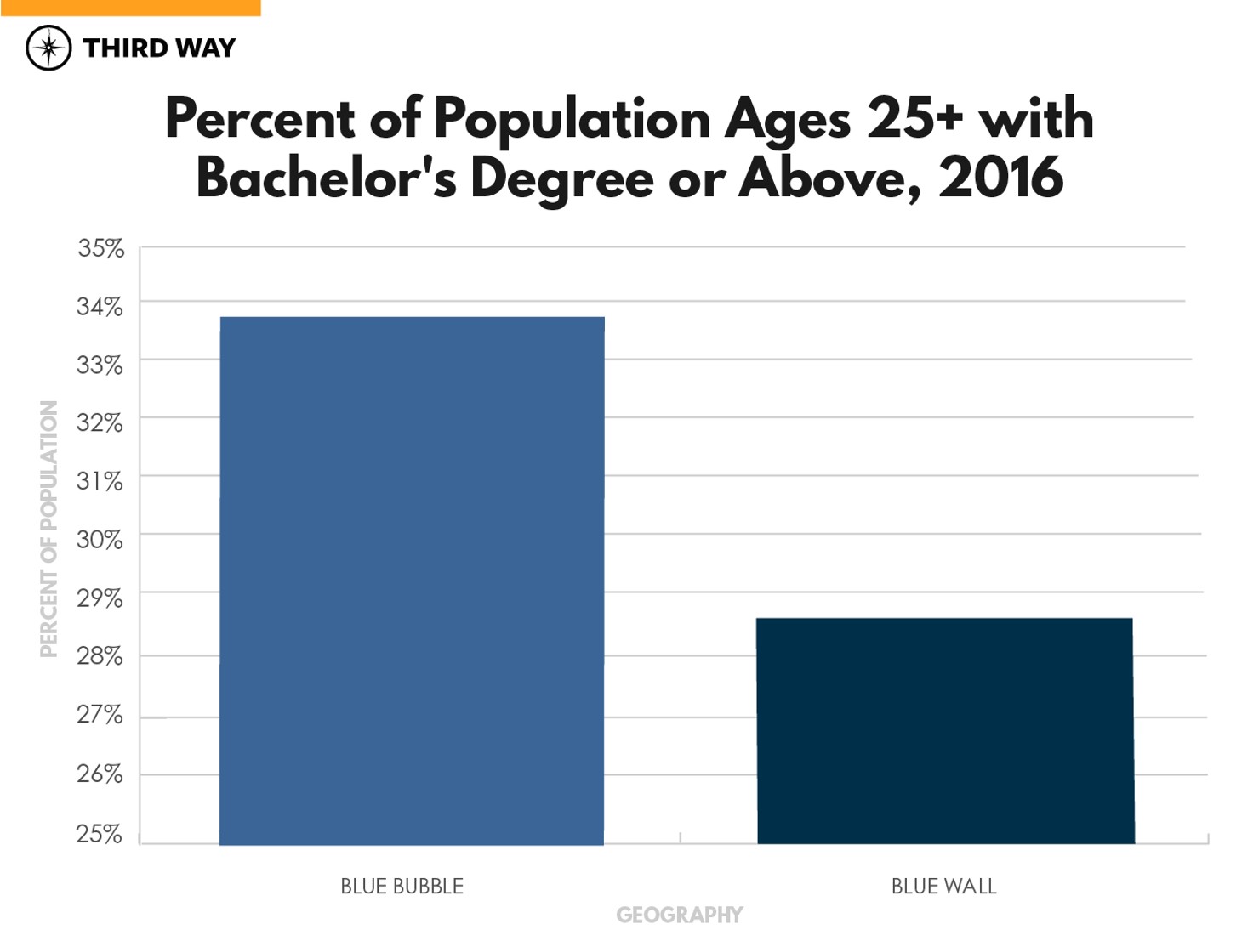
Educational attainment, unlike the other metrics discussed, is showing signs of convergence between the two geographies. From 2009 to 2016, there was a 3.1 percentage point increase in the number of people with college degrees in the Blue Wall, compared to an increase of 2.5 percentage points in the Blue Bubble. 13
7. Black Americans participate in the workforce at lower rates in the Blue Wall than in the Blue Bubble.
In 2016, the labor force participation rate among black workers aged 25 to 64 was 69.2% in the Blue Wall, compared to a labor force participation rate among all races and ethnicities of 77.7%. In the Blue Bubble, the all-encompassing labor force participation rate was a similar 77.9% in 2016. Among black Americans, however, it was 72.9%—nearly four percentage points higher than in the Blue Wall.14
8. Latinos also participate in the labor force less in the Blue Wall than in the Blue Bubble.
In 2016, the labor force participation rates for people of all races and ethnicities aged 25 to 64 in the Blue Wall and the Blue Bubble were 77.7% and 77.9%, respectively. Among Latinos, however, the same figures were 73.4% and 76.7%.15
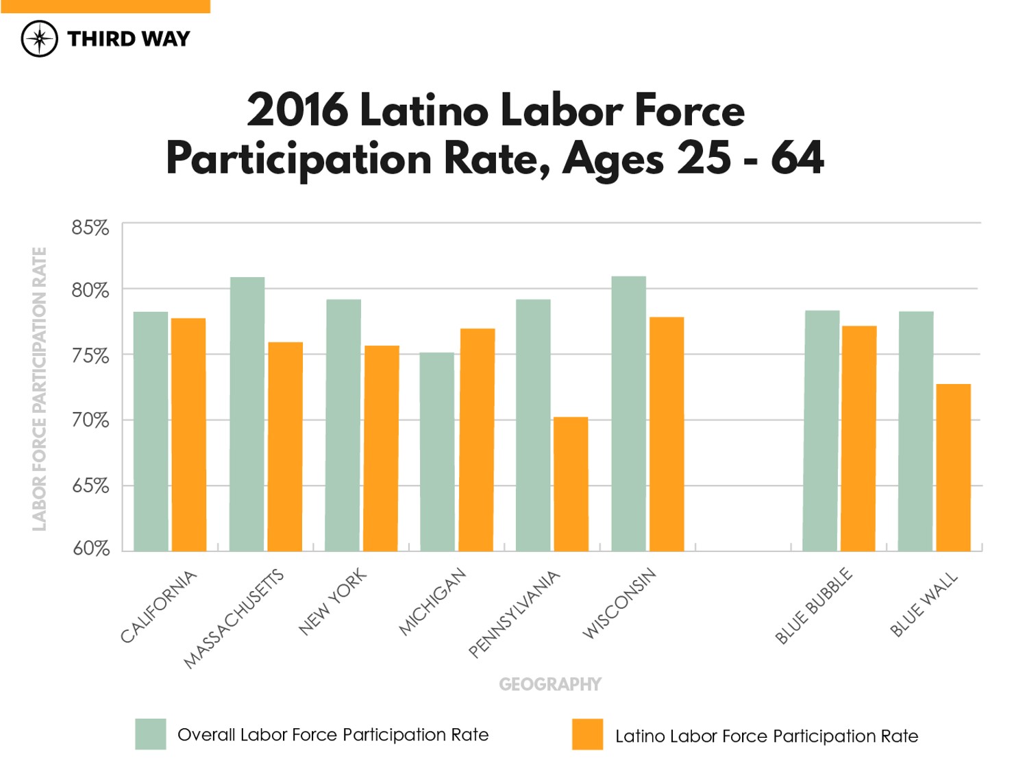
That is to say, despite nearly identical labor force participation rates for people of all races and ethnicities in the Blue Wall and Blue Bubble, Latinos participated in the labor force in the Blue Wall over three percentage points less than in the Blue Bubble.
Conclusion
Despite what topline national indicators may lead you to believe, the post-Recession period for many places in the US was marred by weak business growth, discouraged workers, and modest wage gains. Optimism and opportunity seemed to pool in economic hotbeds.
This is not to say that people and communities in the Blue Bubble do not experience their share of economic problems. Even in booming regions there are groups and neighborhoods left behind. Racism, discrimination, and structural inequality know no geographic boundaries in America, so racial and ethnic-based disparities still persist. Nonetheless, we found that on the whole people of color were doing better in the Blue Bubble than in the Blue Wall.
Likewise, struggling states certainly have economically vibrant regions and many well-off people. Differences between the Blue Bubble and the Blue Wall, however, abound. During a period in which the national economy grew steadily, added jobs, and increased wages, economic opportunity tended to concentrate in specific areas. The divergence of the economics of the Blue Wall and Blue Bubble seemed to lead to a divergence in politics.
As Democrats seek to change their electoral fortunes in 2020, it will pay to view the economy and the availability of opportunity not from the comfort of the Blue Bubble but from the struggle in the Blue Wall.