The Opportunity Index: Ranking Opportunity in Metropolitan America


Takeaways
How well do local job markets allow people to earn a good life in America? We sought to find out by creating the Opportunity Index, which ranks the availability of opportunity in each of America’s 204 largest metropolitan areas based on measures of job quality and quantity. To measure quality, we combine data on wages paid with local cost of living measures to produce four categories of jobs: hardship, living-wage, middle class, and professional. To measure quantity, we rely on local employment-to-population ratios. This combines to form an opportunity score for each region. What we found is a troubling opportunity deficit in much of America.
- Nationwide, just 38% of jobs pay enough to afford a middle or upper class life for a dual income-earning family with children; 32% of jobs pay a living-wage; and 30% pay what we call a “hardship” wage, which is less than what a single adult living on his or her own needs for basic necessities.
- In the four pivotal battleground states of 2016: Wisconsin, Michigan, Pennsylvania, and Florida, the latter three struggled to provide enough opportunity to earn a good life for its residents, according to our index. The Midwest, in particular, had mixed opportunity scores, with some areas clearly making a comeback from deindustrialization and others still left behind.
- Twelve of the 20 lowest scoring metropolitan areas are located in the South. Most low-scoring regions tend to have low employment-to-population ratios, indicating a lack of job availability, as well as an outsized number of jobs that pay only living or hardship wages.
- High living costs, particularly expensive housing, severely restrict the opportunity to earn a middle class life in some of the largest coastal metros that are commonly considered thriving. The San Francisco metro area ranks 149th; the New York City metro area ranks 135th, and the Los Angeles metro area ranks 143rd in our Opportunity Index. High incomes alone do not mean people are keeping up or getting ahead in the place they call home.
- The results starkly depict how much opportunity has bypassed people of color in American metros. Minority representation in the lowest ranking metros in the Opportunity Index is twice that of the 20 highest ranking metros in the Opportunity Index, 44% to 23%.
The opportunity crisis in much of America is the defining economic problem of our time. And it demands a new generation of ideas that spread opportunity to more people and places as American workers, whether they are African American, Latino, Asian, or white, grapple with this era of globalization and technological upheaval.
Introduction
Pathways to opportunity and to a middle class life have shifted as the United States has transitioned away from a manufacturing-oriented economy and towards a service-oriented economy. Radical disruption through technology and globalization has resulted in a relative increase in the demand for high-skilled labor and a hollowing out of middle-skill professions that once provided a comfortable living.1
Taken as a whole, opportunity now looks different, and it’s in different industries and locations. This paper uses a new model to map out which metropolitan statistical areas (MSAs) in the country provide the most opportunity, financially, for Americans to earn a good life. Opportunity, of course, can be subjective. Some analyses look at wages: San Francisco and Boston have very high median incomes, but their very high living costs make that singular approach misleading. Other approaches consider which cities are hubs for large, lucrative industries (entertainment in Los Angeles, finance and media in New York, etc.), but overlook the complexities of the modern job market observed in most metropolitan economies. Another possibility is looking at which places have the highest rate of job growth, but if low-paying jobs are the only ones growing, then the opportunity to earn a good life remains limited.
The Opportunity Index
We developed an Opportunity Index that comprehensively measures the opportunity to earn a good life in all of the MSAs where total employment is at least 100,000. That covers 204 MSAs and 73% of workers in the US, omitting the 27% of the workforce in the most rural parts of the country. (There are 383 MSAs in total according to OMB.) The index gives consideration to two factors:
- Job quality, measured by how much a job pays and the purchasing power of that salary in a given MSA.
- Job quantity, measured by the MSA’s prime-age employment-to-population ratio.
It’s important to emphasize what aspects of job quality are not being measured in this model. It does not account for how emotionally fulfilling a job is, how much room there is for growth in a job, or how physically taxing a job might be. And claims made about which areas have the most opportunity to earn a good life aren’t focused on the aesthetic desirability of the metro, social indicators like crime and health outcomes, general optimism about the future, or whether a region is growing or shrinking. When examining job quality, we are doing so in a strictly financial way: how well does that job pay and how far does that money take you in that area?2
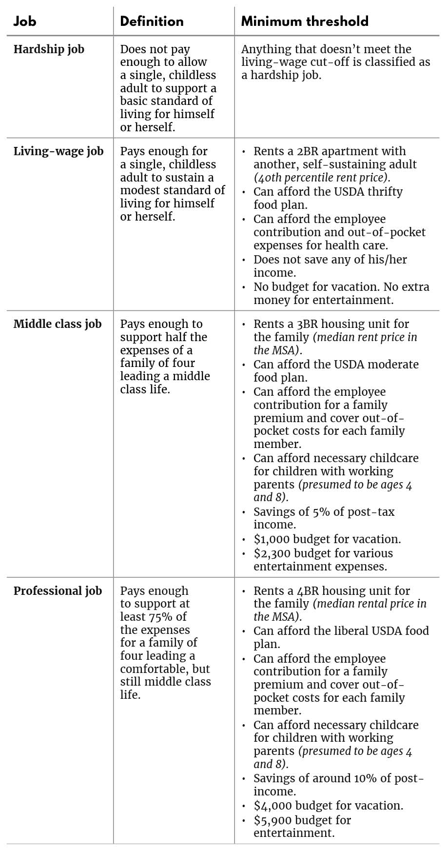
To find job quality in each MSA, the Opportunity Index combines data from the Labor Department’s Occupational Employment Statistics (OES) and a modified version of the Economic Policy Institute’s Family Budget Calculator to categorize each available job into one of four types:


Findings
The findings of this report highlight how scarce opportunity has become in the modern economy. It presents which areas are doing relatively well and which areas are struggling financially, uncovers racial and ethnic demographics that correlate with opportunity, and provides a conceptual roadmap for those looking to evaluate the state of the job market.
1. Fewer than half of all jobs afford a middle class or better life.
Based on our model, only 38% of the jobs in the 204 most populous metro areas examined can be considered middle class or professional jobs. Within that share, 23% are middle class jobs and 15% are professional jobs. A stunningly high 30% of jobs in America’s metros are hardship jobs, failing to provide a decent standard of living for a single adult living on their own. Another 32%, the largest share, are living-wage jobs, enough for a worker to get by but not enough to meet commonly held expectations for a middle class life.

To put this another way, only 38% of jobs pay more than the equivalent of $44,066 per year in the median cost of living region in the country. To qualify as a middle class or better job in a high-cost area like San Francisco, a job must pay at minimum, $82,142. In a lower cost area like Cedar Rapids, Iowa, a middle class job starts at $40,046.
This low national figure for middle class or better jobs means that to work full time and live a life where one gets ahead, people must make do in other ways – living in a more modest housing unit than what is typical in that MSA, taking gig jobs on the weekend, accepting a longer commute, having fewer children or having them later, skipping vacations, or putting off saving for retirement. For holders of the other 62% of jobs that classify as living-wage or hardship, some of those people may consider themselves middle class and may not live paycheck to paycheck, but their full-time, primary jobs alone likely are not sufficient to get ahead without sacrifices or government benefits.6
2. Three out of the four closest battleground states that went for Trump struggled to provide opportunity. As a whole, the Midwest had mixed results. Some states performed well, but others, like Michigan and Pennsylvania that swung to Trump in 2016, did not.
Putting a spotlight on the four states most critical to swinging the election to Donald Trump in 2016, three of them (Michigan, Pennsylvania, and Florida) struggle to provide enough opportunity to earn, according to our index. Florida performs exceptionally poorly on the Opportunity Index. There are 17 MSAs in our sample from Florida and the average rank for those places is 167th out of 204. Only 34% of jobs in Florida provide a job that’s middle class or better and the prime-age employment-to-population ratio is only 70%, compared to the nationwide average of 75%. Overall, it’s the second lowest performing state in the country. Pennsylvania and Michigan perform better than Florida but still struggle to provide enough opportunity. The average rank for the 9 MSAs in Pennsylvania is 87th. In Michigan, the average rank for its 6 MSAs is 77th. To be fair, both are above the national average, but remember that on average, the country as a whole is struggling to provide opportunity. In Pennsylvania, only 37% of jobs are middle class or better and the employment-to-population is 76%. In Michigan, 41% of jobs are middle class or better, but the employment to population ratio is only 73%.
The fourth state that swung to Trump, Wisconsin, tells a different story. The average rank for a metro in Wisconsin is 13th, 43% of jobs are middle class or better, and the prime-age employment-to-population ratio is an impressive 81%.
The relative strength of Wisconsin, Minnesota, and Iowa ensure that 12 of the top 20 MSAs for opportunity are in the Midwest. The metro regions centered around Rochester, Minnesota, Cedar Rapids, Iowa, and Des Moines, Iowa take the gold, silver, and bronze for opportunity. Looking at Rochester which has the most opportunity to earn out of any metro examined, not only are 45% of its jobs considered to be middle class or better, but it also has an employment-to-population ratio of 84.6%, the third highest in the country.
But these strong metros in the Midwest are offset by a number of struggling areas such as Flint, Michigan (ranked 153rd); Youngstown, Ohio (119th); and Erie, Pennsylvania (139th). There are also many struggling rural communities and smaller MSAs in the Midwest (just as there are in other regions) not accounted for in these results.
We found that places offering more opportunity to earn a good life than others have commonalities: Cedar Rapids, Iowa; Lincoln, Nebraska; Cleveland & Columbus, Ohio; Madison, Wisconsin; Minneapolis & Rochester, Minnesota; and Raleigh-Durham, North Carolina all have close proximity to major research universities or, in the cases of Rochester and Cleveland, large medical institutions (The Mayo Clinic and Cleveland Clinic). These metros tend to have low living costs and inexpensive housing. For example, housing is four times more expensive in the San Francisco metro than the Cedar Rapids metro.
That is why we found some counterintuitive results in our index. In general, Midwestern cities in Iowa, Minnesota, Wisconsin, and parts of Ohio offer relatively more middle class jobs, while places like Los Angeles, New York City, and San Francisco that are generally dubbed as “thriving” are struggling more than it often appears to provide middle class jobs.
It’s important to note again that this index does not measure certain things that make places like Los Angeles, San Francisco, and New York City appealing. The model does not take into account the desirability of the industries in an MSA. It does not account for high growth opportunities (the next big company is far more likely to come out of San Francisco than Cedar Rapids), and it does not account for dynamism and new business growth in the MSA.7 In this model, we are looking only at job quality (measuring how well a job pays and how far that money can take you in a given MSA) and job quantity (measuring how many people actually have access to the labor market). The chart below shows the top 20 scores generated by the Opportunity Index as well as the nationwide average. Scores on the index range from a low of 1.61 to a high of 2.63 with a nationwide average of 2.13.

Note: See methodology for how Opportunity Index is calculated
A number of major metros missed the cut for the top 20 but still rank in the top 50, meaning they are relatively high on the opportunity scale. These include Kansas City (21st), Dallas (26th), Omaha (27th), Seattle (29th), Cincinnati (32nd), Boston (33rd), Salt Lake City (35th), Austin (38th), Pittsburgh (40th), Houston (41st), St. Louis (43rd), and Baltimore (44th).
3. Twelve of the bottom 20 MSAs for opportunity are in the South
The metros centered around Fayetteville, North Carolina, Myrtle Beach, South Carolina, and Salinas, California score the lowest in our Opportunity Index. The chart below shows that among the bottom 20 MSAs by opportunity score, most are concentrated in the South.
For the twelve low opportunity southern metros, cost of living is not the problem. It’s a lack of job quantity driven by low employment-to-population ratios; each of the twelve Southern MSAs in the bottom 20 has an employment-to-population ratio below 70%, which is very poor compared to the employment-to-population ratio of the country (75%).8 So whereas five of the other metros at the bottom of the index in California are plagued with high living costs, these Southern cities’ lack of opportunity is being driven by overall job quantity.9
For example, in Fayetteville, North Carolina, just 35% of jobs offer pay above $40,846 (the level that represents the bottom bound for middle class jobs), which is three points below the national average. Moreover, the employment-to-population ratio is 59%, 16 points below the national average. Compare this to Santa Rosa, California which has the average employment-to-population ratio of 75%, but high living costs mean only 27% of jobs pay more than $61,506 (the lower bound of middle class pay).

Note: See methodology for how Opportunity Index is calculated
One outlier on this list is worth highlighting. Nassau and Suffolk County in New York have a low opportunity rating because they are high cost suburbs of New York City and many of their residents work in jobs in the New York City metro area. Nassau and Suffolk have median household incomes of $100,000 and $90,000, respectively. So because cost of living is high and enough people do not work in the MSA where they live, Nassau and Suffolk appear on the list with the least amount of opportunity to earn even though the area itself is likely not struggling in the way these other metros are.
4. High living costs in coastal areas, led by housing, can severely restrict the opportunity to earn a good life
Noticeably missing from the top 50 are a few of the largest coastal hubs that are often considered to have thriving economies: Los Angeles, the San Francisco Bay Area, and New York City. The difference is a high cost of living, particularly for the three metros that comprise the Bay Area: San Francisco, San Jose, and Oakland.10

The median rent for a three bedroom unit in San Francisco is $52,848 per year according to the Department of Housing and Urban Development. For Cedar Rapids, the median price for a three bedroom unit is only $13,872 per year. Consider that the most expensive of the 204 metro areas based on housing is more than double the price of the 20th. The Bay Area (which has no doubt seen an economic boom based on raw GDP growth, measures of innovation, and impact on the world) still has a job market that fails to provide a good, affordable life for a broad share of its workers. The median income of a new home buyer in San Francisco is $303,000; at the same time, the city counts a homeless population of 7,500.11
Based on our model, a job in Cedar Rapids needs to pay only $40,046 to provide a middle class life. Since the median wage there is $38,720, almost half of all jobs are middle class or better. In San Francisco, one needs to make $82,142 to achieve a middle class life. The median wage is $57,290, higher than almost anywhere in the country, but not high enough to earn a middle class life in the city.
A machinist in Cedar Rapids makes on average $45,470, well short of the $57,220 the same job pays in San Francisco. But the lower paid Cedar Rapids machinist is leading a middle class life while their San Francisco counterpart falls well short. Same job; different life.
This leads to an inevitable conclusion that an opportunity agenda would entail different types of policies for different places. A minimum wage right for Cedar Rapids might be wrong for San Francisco. An affordable housing policy for San Francisco might be wrong for Cedar Rapids.
It’s a stark picture of just how much cost of living matters when it comes to the opportunity to earn a good life. And it shows that contrary to how large coastal metros are portrayed, some are not providing opportunity to a particularly broad slice of the population. According to the Opportunity Index rankings, San Francisco places 149th, San Jose is 101st, New York City is 137th, Los Angeles is 145th, and Oakland is 166th.12
5. Opportunity is most scarce in MSAs with large minority populations
The areas providing the most opportunity to earn a good life have a high concentration of non-Hispanic whites, and the areas with the least have high minority populations. In the top 20 highest scoring MSAs, non-Hispanic whites comprise 77% of the population, compared to 66% for all 204 MSAs. At the bottom, the 20 scoring last in opportunity are 56% non-Hispanic white. Thus, the minority population is almost twice as large in low opportunity MSAs as high opportunity MSAs (44% to 23%).
The graph below compares the percentage of the population that’s non-Hispanic white (on the x-axis) to the opportunity index score (y-axis). The trend line shows that the percentage of non-Hispanic whites and the opportunity index score are positively correlated.

Another way of examining demographic disparities is to isolate the differences in opportunity for the 20 areas with the highest concentration of non-Hispanic whites (89.2%) and the 20 areas with the lowest concentration (30.5%). The employment-to-population ratio for the top 20 least diverse areas is 76.3% compared to 70.8% in the most heavily minority MSAs. Thirty-eight percent of jobs in the least diverse communities are middle class or better, precisely the average nationwide. This is compared to 34% for the most heavily minority communities.
There are exceptions. The Washington DC metro has a majority minority population and an opportunity score of 2.43 and a ranking of 13. The Huntington, West Virginia metro area is almost 95% white and has an opportunity score of 1.86 and a ranking near the bottom at 186th.
Nonetheless, the average opportunity score for the most heavily minority communities is 1.96 compared to 2.22 for the least diverse communities. However you slice the data, the trend is clear: communities with higher concentrations of minority populations tend to have less opportunity to earn a good life.
The reasons for the racial gap in the Opportunity Index are many, ranging from outright racism and discrimination to unequal educational opportunities, criminal justice disparities, and the legacies of injustices relating to civil rights, voting rights, and segregation. A history of redlining forbade people of color from owning homes in the most upwardly mobile neighborhoods, which has ensured that minority communities, on average, face stiffer challenges in their search opportunity than their white counterparts. The earnings gap between black and white men has remained static since 1979. Thus, depending on who you are or where you live, the starting line for opportunity is drawn at a different point in the track. This paper’s findings are a stark reminder that policies put forth to address the opportunity crisis in America need to be race-conscious.
Conclusion: A Focus on the opportunity crisis
The results from our model indicate that the opportunity to earn a good life is scarce throughout the United States. Only 38% of jobs in major metro areas adequately support a middle class life. This reality explains why, nine years into a recovery and facing 3.7% unemployment, American workers still feel distressed economically. It also further corroborates existing evidence that opportunity is even scarcer for people of color than for their white peers.
Policymakers should focus on expanding the supply of good-paying jobs, expanding the take-home pay for the millions of workers in low wage jobs, reducing the cost of living in many of these metropolitan areas, and seeking remedies to discriminatory practices and biases that ration opportunity. Third Way has released a bold list of 12 policy ideas that will help expand the opportunity to earn for everyone, everywhere. These ideas are not the totality of what would constitute an Opportunity Agenda. But among the policies we propose, several seem most pertinent to expanding opportunity to more people and places in the more opportunity-scarce MSAs in the country.
Clearly, there must be an answer to the paucity of start-up capital in much of the country and particularly for African-Americans, Latinos, and women of all races who struggle to get loans and equity to back jobs-producing ideas. A $7.25 minimum wage is inadequate anywhere in America, but a minimum wage of $15 an hour would be wrong for low cost areas as well. A regional minimum wage coupled with a working wage break that means zero federal taxes on the first $15,000 of all earned income would help low wage workers stretch their pay. Health insurance is a major driver in rising living costs and needs to be both universal and affordable. A national apprenticeship program would allow more people to earn a higher and more stable wage and afford a middle class life. A Universal Private Pension on top of Social Security would significantly boost retirement savings, particularly for African-American, Latino, and female workers who have far lower participation rates in private retirement plans. Broadband for All would connect rural communities and left-behind urban neighborhoods to the digital economy. Eliminating barriers to employment for those who have served time in prison is essential for a struggling slice of the male, and often minority, population. Paid leave and parental flex time would help families with young children remain in the workforce.
The opportunity to earn a stable and secure life has been at the heart of the American Dream. However, technology and globalization have made opportunity more abundant for some and less abundant for many others. There is too little opportunity in America today and its dearth is undoubtedly related to the polarization and divisions apparent in the country.
David Brown is the former deputy director of Third Way’s Economic Program. He contributed to this report only during his tenure at Third Way.
Appendix: How to measure opportunity
Methodology
The model uses the 204 metropolitan statistical areas in the United States with the highest number of jobs. Two hundred and four was chosen because it’s the cutoff point for metropolitan areas with 100,000 or more jobs.
Data for this model comes from the Economic Policy Institute’s (EPI) Family Budget Calculator, Occupational Employment Statistics from the Bureau of Labor Statistics, and the US Census. Below, we explain how we combine the datasets and the reasoning behind the adjustments we make to EPI’s Family Budget Calculator.
Job Quality
Beginning with the first component of the model that determines job quality in each city, EPI’s Family Budget Calculator shows how much money a typical individual or family would need to cover a “modest, yet adequate standard of living.” It includes the costs of housing, food, child care, transportation, health care, taxes, and other items of necessity in a given metropolitan area. The budget does not include items associated with the middle class, such as savings, entertainment, or vacation. To use the budget calculator, one can simply type in a metro area, select the desired family size, and then see how much money that family would need to meet this standard of living. For example, in the New York City metro area, EPI estimates that a family of four would require $124,129.
We build upon EPI’s model by creating three different living standard thresholds, and thus, four categories of jobs. The four categories of jobs are: hardship jobs, living-wage jobs, middle class jobs, and professional jobs. Our purpose is to illustrate how many of each type of job is available in each metropolitan statistical area (MSA) in the United States.
Once we established our definitions for hardship jobs, living-wage jobs, middle class jobs, and professional jobs, we looked to determine how many jobs in each city could provide such a living standard. Using Occupational Employment Statistics data from the Bureau of Labor Statistics, we find the 10th percentile, 25th percentile, median, 75th percentile, and 90th percentile of wage earners in each occupation in each metropolitan statistical area. Unfortunately, data isn’t available at a more granular level, so we used the Line Estimation function in Excel to estimate the rest of the distribution between the 10th and 90th percentiles. Line estimation uses the Ordinary Least Squares technique to fit the best possible line between the data points. We used the Line Estimation function in Excel to create a third order polynomial function that shows the full income distribution for every metropolitan area. So if our living cost framework indicates that a single adult in New York City requires $51,323 to lead a living-wage life, we could use this function to figure exactly where $51,323 places someone on the wage distribution. Similarly, once we determined the income necessary for a middle class life for four in New York City, $130,616 by our calculation, we could plug half of that number, $65,308, into our function and determine the percentage of jobs that fall above and below that wage threshold.
We make the subjective assumption that being middle class requires both of the adults in the family to work. Therefore, we classify a middle class job as one that gets a family of four at least half the necessary income for a middle class life. Our definition of middle class is rooted in polling data. Pew data shows that having a secure job, owning health insurance, saving for retirement, owning a home, and being able to pay for college constitute a middle class lifestyle.13 An ABC-University of Connecticut poll confirms that being part of the middle class means being able to own a home, save for retirement, and have money for vacation, a new car, or entertainment.14 Taking into account this polling data, a middle class life is defined in this model to be one that covers the basic necessities laid out in the EPI’s Budget Calculator plus money for vacation, savings, and extra spending on entertainment.
We also make a subjective assumption about professional jobs. We presume that a professional job is one that affords a greater degree of flexibility for the second earner in a family, as well as a more comfortable lifestyle. If one job gets a family at least 75% of the way towards this comfortable living standard, as we define it, then we classify the job as professional. But by no means should this threshold be considered wealthy.
Adjustments to the EPI Model
EPI’s budget for a single working adult—with a handful of our own adjustments—serves as the cutoff for a living-wage job in our framework. Anything below that cutoff we consider to be a hardship job. A middle class job, which we define as one that can support at least half the expenses of a family of four, uses the EPI budget for a family of four plus additional expenditures for vacation, savings, entertainment, a less thrifty food budget, and upgraded housing. A professional job, which supports at least three-fourths of the required expenses for a comfortable but by no means wealthy or extravagant life for four, adds additional spending in the aforementioned categories.
For housing, EPI assumes that a single adult rents a studio apartment at the 40th percentile pricewise in their geographic area. We assume that a living-wage job entails sharing a two bedroom apartment with another, self-sustaining adult, also at the 40th percentile. This cuts the housing costs slightly. For a family of four, EPI assumes they rent a two bedroom housing unit also priced at the 40th percentile. For a middle class living, we presume that a family of four should be able to rent a three bedroom housing unit at the median price of the local area’s housing market. For a professional job, we presume the family should afford a four bedroom unit at the median price. Median housing price data is available from the Department of Housing and Urban Development.15 For example, EPI’s budget calculator shows that a family of four’s housing costs (two bedroom unit at the 40th percentile) in the Washington DC metro area will be $20,313. The median price for a three bedroom unit at the 50th percentile is $28,236 per year. Thus, we add almost $8,000 to the cost of housing in our model for a middle class life. A four bedroom unit at the median prices costs $34,824 per year so when dealing with housing for those in the professional class, we add an additional $14,000 to EPI’s baseline.
For food, EPI uses June 2017 data from the Department of Agriculture (DOA) to calculate the cost for a family of four per year.16 The DOA provides estimates for the monthly cost of food at four different levels. Starting from the least generous, there’s the thrifty plan, low-cost plan, moderate plan, and liberal plan. EPI uses the low-cost plan ($9,272 per year) to calculate food costs in their budget calculator. DOA’s data is not adjusted by location so EPI combines DOA data with Feeding America’s “Map the Meal Gap” project to adjust food costs by location. So for any given metro, we take the cost of food given from EPI (which is already adjusted for location) and make these further adjustments: add $4,799 for professional class, add $2,171 for middle class, and subtract $2,145 for living-wage. This is the logic behind it:
- We presume a middle class family should be able to afford the moderate plan ($11,433 per year) so we add $2,171 (11,433-9,272) to the cost of food for a middle class family.
- For professional class families, we presume they can afford the liberal food plan ($14,071 per year) so we add $4,799 (14,071-9,272) to the cost of food for a professional class family.
- For living-wage workers, we assume they can get by on the thrifty plan ($7,127), so we reduce the cost of food for them by $2,145 (9,272-7,127).
For child care, we use the same measurement technique as the EPI, which uses data from the annual Child Care Aware of America report. We do not make any adjustments to this cost for our measurement of a middle class job or a professional job.
For transportation, EPI uses the Center for Neighborhood Technology’s Housing and Transportation Affordability Index, which estimates actual spending on auto ownership, auto use, and transit use by geographic area. The Center for Neighborhood Technology adjusts the assumed number of miles traveled for each family in each geographic area downward to reflect only work and nonsocial trips for the first adult in a household and only work trips for the second adult. Because our living-wage standard is more modest than EPI’s family budget standard, we adjust downward the cost of transportation for our living-wage threshold by 25%. That is based on our estimate of the transportation needs of a working single adult, who purchases a five year old, fuel efficient coupe; finances the vehicle over five years with no money down with average credit; and incurs average insurance, vehicle tax, maintenance, repair, and fuel costs for his or her geographic area. We do not make adjustments to EPI’s transportation budget for our middle class or professional class living standards.
For health care, we use our own calculation outside of the EPI’s Family Budget Calculator. The EPI assumes people get health care through the ACA exchanges. Since the majority of workers get health insurance through their employer, we use data from the Kaiser Family Foundation showing the average employee contribution to health premiums, for family plans and individual plans. This data is available at the state level. We combine the employee contribution to health premiums with 2015 data on out-of-pocket costs for individuals. The survey breaks down the median out-of-pocket expenses based on family type. The median annual out-of-pocket medical expenditures for an individual is $240. For a family of two adults and one or more children, that number is $721. The out-of-pocket expenditure data is for the whole country. For example, in Washington DC, the typical employee pays $5,476 towards the family premium. We take this number and add $721 to figure out health care costs for the family of four. A single person in Washington, DC pays $1,493 on average towards their premium. We add $240 and then adjust for inflation. Of course, actual out-of-pocket health care costs vary extensively by workplace coverage, region, class, and other factors. For purposes of this report, since it is focused on the living standards of people who work full-time, we feel this measure is the best available approach.
To help get a more complete picture of a middle class life, we added expenditures for entertainment based on data from the Consumer Expenditure Survey. The survey is divided into five income quintiles for expenditures. For the middle class, we presume families should be able to spend as much as the middle quintile does on entertainment, which is $2,300 per year. For the professional class, we presume they should be able to spend as much as the upper quintile, which is $5,900 per year. Again, these numbers are the same across all MSAs.
For vacation, there is no particularly useful measurement in the Consumer Expenditures Survey. So far purposes of this report, we presume that a middle class family should be able to spend $1,000 per year on a vacation while a professional class family should be able to spend about $4,000 per year on vacation.
Part of being middle class is being able to regularly save at least a modest amount, in addition to Social Security and any employer contributions to a retirement plan. We presume that 5% of annual post-tax income is a reasonable minimum amount. For the professional class, we presume 10% post-tax income is a reasonable minimum.
Vacation and savings costs are of course both normative judgments and open to debate.
Finally, we made adjustments to the tax calculations since the Family Budget Calculator is based on the pre-Tax Cuts and Jobs Act tax code. We took a sample of ten cities (all different sizes and geographies), used the same National Bureau of Economic Research Tax Simulator as EPI, and followed the steps EPI enumerates in their methodology section without using their weighting procedure. We first calculated what the taxes would be for a family of four in 2016 and then again in 2018. For all ten cities, the average drop in the tax rate was 20%. As such, we did an across-the-board cut of 20% for the tax figures in EPI’s numbers. To confirm that the results wouldn’t be significantly altered if we included the EPI’s weighting procedure, we did another sample with several cities where we followed every step of EPI’s methodology to calculate tax burden (including the weighting procedure) for 2018 and got roughly the same result: a 20% reduction in taxes.
We made the same tax adjustment for living-wage jobs, which meant seeing how much a single adult with no children stood to gain from the Tax Cuts and Jobs Act. On average, our sample yielded a 10% drop in taxes paid after accounting for the new law.
The following table summarizes each job category:
Job Quantity
The second component of the model, job quantity, is much simpler to calculate. It is a needed calculation though because without accounting for how many of those jobs are available, the information can be misleading. For example, Beaumont, Texas has 49% of its jobs classified as middle class or better, but only 66% of the prime-age working population is in the workforce. In Beaumont, it’s hard to say then that the job market is providing a lot of opportunity to its citizens.
To find that 66% number, the model uses population data from the Census Bureau which shows how many people between ages 25 and 64 live in a given area and how many of those people are employed. Simply dividing the latter by the former gives the employment-to-population ratio.
So in summation, we have a breakdown of how many jobs in each MSA are hardship, living-wage, middle class and professional and the employment-to-population ratio in each city.
Final Calculation
Here’s how we calculated the final index: First, we looked at the distribution of jobs. So for example, in Washington DC:
- 32% of jobs are considered hardship
- 22% of jobs are considered living-wage
- 24% of jobs are considered middle class
- 22% of jobs are considered professional
Then, we assigned a point value to each category of job. Hardships jobs were worth one point. Living-wage jobs were worth two points, middle class jobs got three points, and professional jobs got four points. The idea here is to reward MSAs for the types of jobs they provide their citizens, so cities with a higher proportion of professional and middle class jobs will score better. So for DC, this adds up to:
- (1*0.32)+(2*0.22)+(3*0.24)+(4*0.22)=2.36
So far, we’ve only accounted for job quality, not job quantity. We clearly want to reward cities with exceptionally high employment-to-population ratios. The question is what qualifies for exceptionally high? What should be the base against which we compare? We chose 77.5% as the employment-to-population ratio to compare against. This is the nationwide high for the employment-to-population ratio of 25-64 year olds reached since 1995 and what we feel the employment-to-population ratio should be now. It happened in 1998, 1999, and 2000. Once we chose 77.5% as our baseline, we took the employment-to-population ratio for a given MSA and divided it by 77.5 to come up with a measure of job quantity health. For example, Washington DC has an employment-to-population ratio of 80.
- 80/77.5=1.03
We then take that 1.03 and multiply it by 2.36 to get the final opportunity index score: 2.43. Washington DC happens to get a boost from its impressive job quantity. Most MSAs have their scores reduced when accounting for job quantity. This process is repeated for all 204 metro areas.
Endnotes
David Autor, “Why Are There Still So Many Jobs? The History and Future of Workplace Automation,” Report, Journal of Economic Perspectives, Volume 29, Number 3, Summer 2015, Pages 3-30. Date Accessed: October 24, 2018. Available at: https://economics.mit.edu/files/11563
We make assumptions about the quality of benefits, such as for health care and retirement, which can vary widely from job to job.
The average here was calculated by finding the threshold between hardship job and living-wage job for each of the 204 metros and then taking the average cutoff point between the two categories. The same goes for the subsequent categories.
Prime-age is traditionally defined as 25-54, but we use 25-64 to reflect the reality that most people in their late 50s and early 60s need to work to support themselves.
A full breakdown of how we create the index can be found in the appendix.
A single mother with children making a hardship or living-wage job salary would likely qualify for SNAP, the EITC, reduced prices for school lunches, etc. It might make life a little bit easier, but it likely would not be enough to provide a middle class life.
For the latter, Third Way has another report measuring the prevalence of new businesses and job creation in every county.
The same story goes for Huntington, West Virginia: low employment-to-population ratio and low median wage.
Honolulu has a similar story to California: high cost of living driving down opportunity to earn.
In our dataset, San Francisco and Oakland are classified as two separate metro areas. Other datasets classify them as one area.
Scott Wilson, “San Francisco, rich and poor, turns to simple street solutions that underscore the city’s complexities,” The Washington Post, 3 Sep. 2018. Available at: https://www.washingtonpost.com/national/san-francisco-rich-and-poor-turns-to-simple-street-solutions-that-underscore-the-citys-complexities/2018/09/03/d6cf321a-ad4d-11e8-8a0c-70b618c98d3c_story.html?noredirect=on&utm_term=.2c76c7b1bef2.
While San Francisco and Oakland are sometimes lumped together as one metro area, our data separates them.
Wendy Wang, “Public Says a Secure Job Is the Ticket to the Middle Class,” Report, Pew Research Center, August 31st, 2012. Accessed October 24th, 2018. Available at: http://www.pewsocialtrends.org/2012/08/31/public-says-a-secure-job-is-the-ticket-to-the-middle-class/.
“The Meaning of Middle Class,” Blog, Roper Center for Public Opinion Research, Cornell University. Accessed October 24th, 2018. Available at: https://ropercenter.cornell.edu/meaning-middle-class/.
The Excel spreadsheet used is entitled “Data by Area”.
This data is updated monthly. We used the December 2017 data.
Subscribe
Get updates whenever new content is added. We'll never share your email with anyone.